
WP SmartPay forms are built in the WordPress block editor. This reference covers every field block you can add to a payment form — what each one does, its inspector settings, and how to use the Layout Columns option to control how fields display side by side.
Required Fields
Every new form includes two required fields that are added automatically when you use the Guide helper:
Name Field — Collects the customer's full name. Required for all payment receipts and customer records.
Email — Collects the customer's email address. Used for payment receipts and subscription notifications.
Note: You can still add these fields manually from the Guide if they are not yet on the canvas.
Adding Fields with the Guide
The fastest way to add fields is via the Guide button in the editor toolbar (top-right area of the editor).
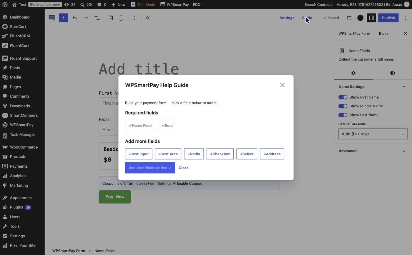
Clicking a field button in the Guide inserts it at the end of the form canvas. The Guide stays open so you can add several fields in one pass.
Name Fields Block
The Name Fields block collects the customer's full name. Select the block in the editor to open its inspector on the right.
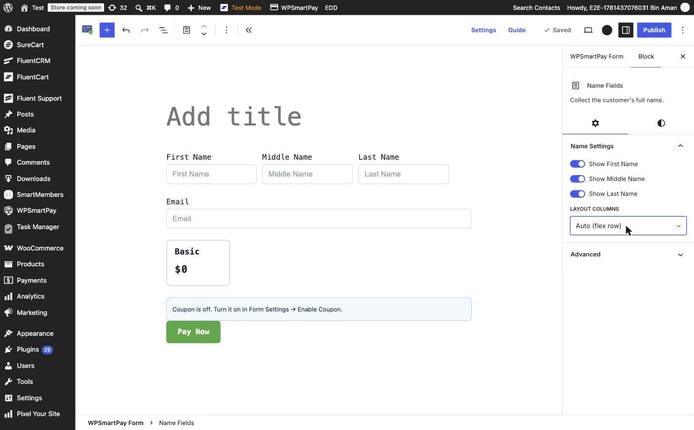
Name Settings
Show First Name — Toggle to show or hide the First Name input (on by default).
Show Middle Name — Toggle to show or hide the Middle Name input (off by default).
Show Last Name — Toggle to show or hide the Last Name input (on by default).
Layout Columns
The Layout Columns dropdown controls how the visible name sub-fields are arranged horizontally:
Auto (flex row) — Sub-fields sit side by side, sharing the available width equally. Best for most forms.
1 Column — Each sub-field stacks vertically. Useful on narrow embeds.
2 Columns — Two sub-fields per row, third wraps to the next line.
3 Columns — All three sub-fields in one row at equal widths.
Address Fields Block
The Address Fields block collects a full postal address. Select the block to open its inspector.
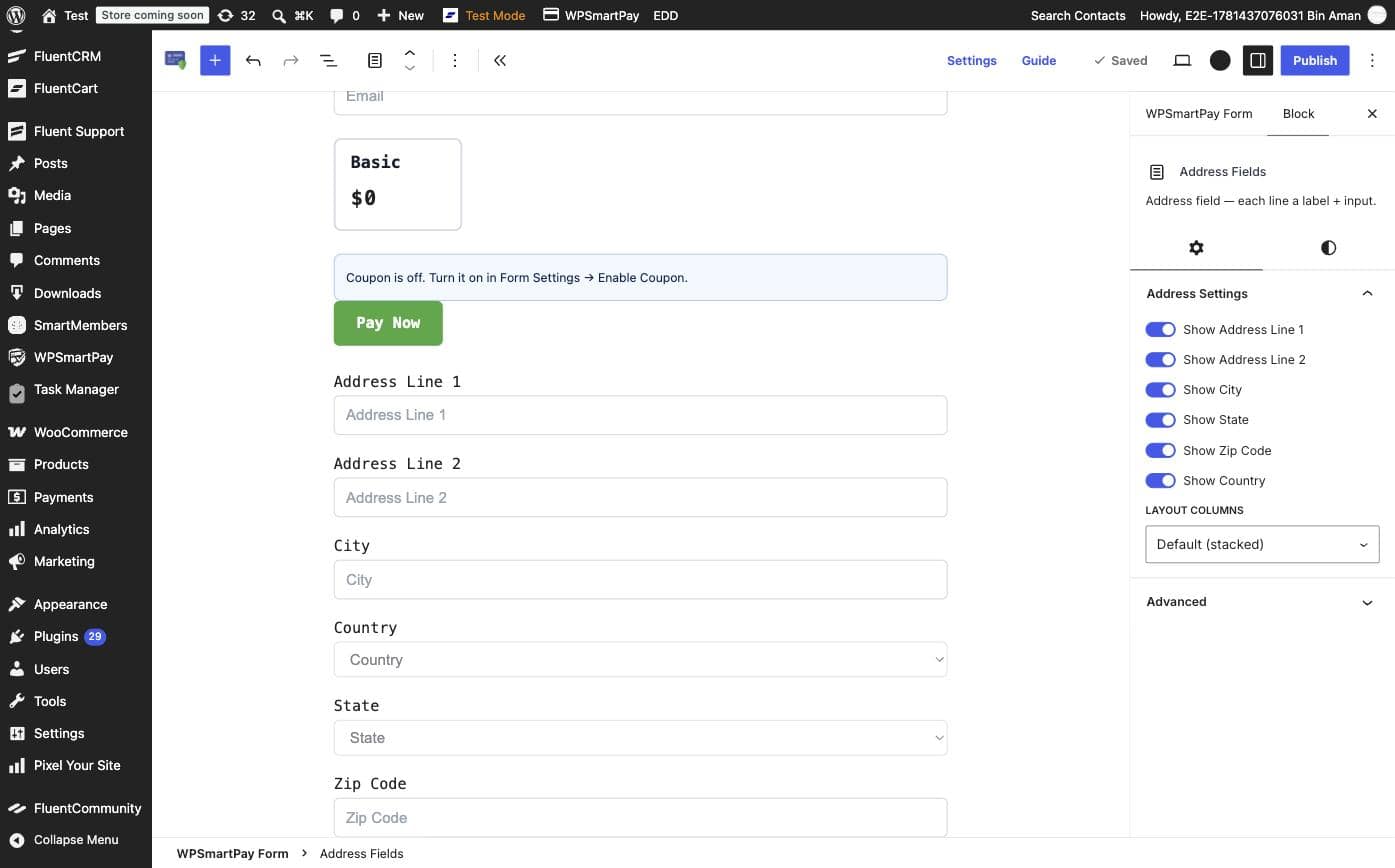
Address Settings
Show Address Line 1 — Street address (on by default).
Show Address Line 2 — Apartment, suite, or unit (on by default).
Show City — City or town field (on by default).
Show State — State, province, or region (on by default).
Show Zip Code — Postal or ZIP code (on by default).
Show Country — Country selector (on by default).
Layout Columns
The Layout Columns dropdown for Address Fields works the same as for Name Fields:
Default (stacked) — Each address line on its own row. This is the default and suits most layouts.
Auto (flex row) — Address fields flow into a flexible row. City, State, and Zip can sit side by side on wide screens.
2 Columns / 3 Columns — Fixed column grids for compact checkout forms.
Additional Field Blocks
Use the Guide or the block inserter (+ button) to add any of these optional field types:
Field | What It Collects | Typical Use |
|---|---|---|
Text Input | Single-line free text | Company name, reference number, promo code |
Text Area | Multi-line free text | Order notes, delivery instructions, custom message |
Radio | One choice from a list | T-shirt size, subscription tier selection |
Checkbox | One or more choices from a list | Terms agreement, add-on selections |
Select | One choice from a dropdown | Country, colour, quantity |
Address | Full postal address (multi-field) | Physical delivery, billing address |
Tips
Field data collected from custom fields is stored on the payment record and visible in the Payment Detail page.
Use the Layout Columns setting on Name and Address blocks to create compact, two- or three-column field rows without any custom CSS.
If a field is not needed, toggle it off in the inspector rather than deleting the block — this preserves your block settings if you need to re-enable it later.